Project 013
Fogata
A romantic restaurant with a flair for spirited dining in Whistler.

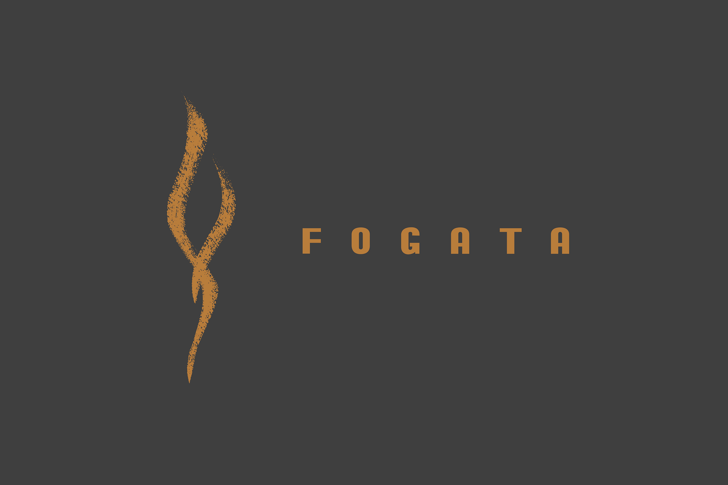
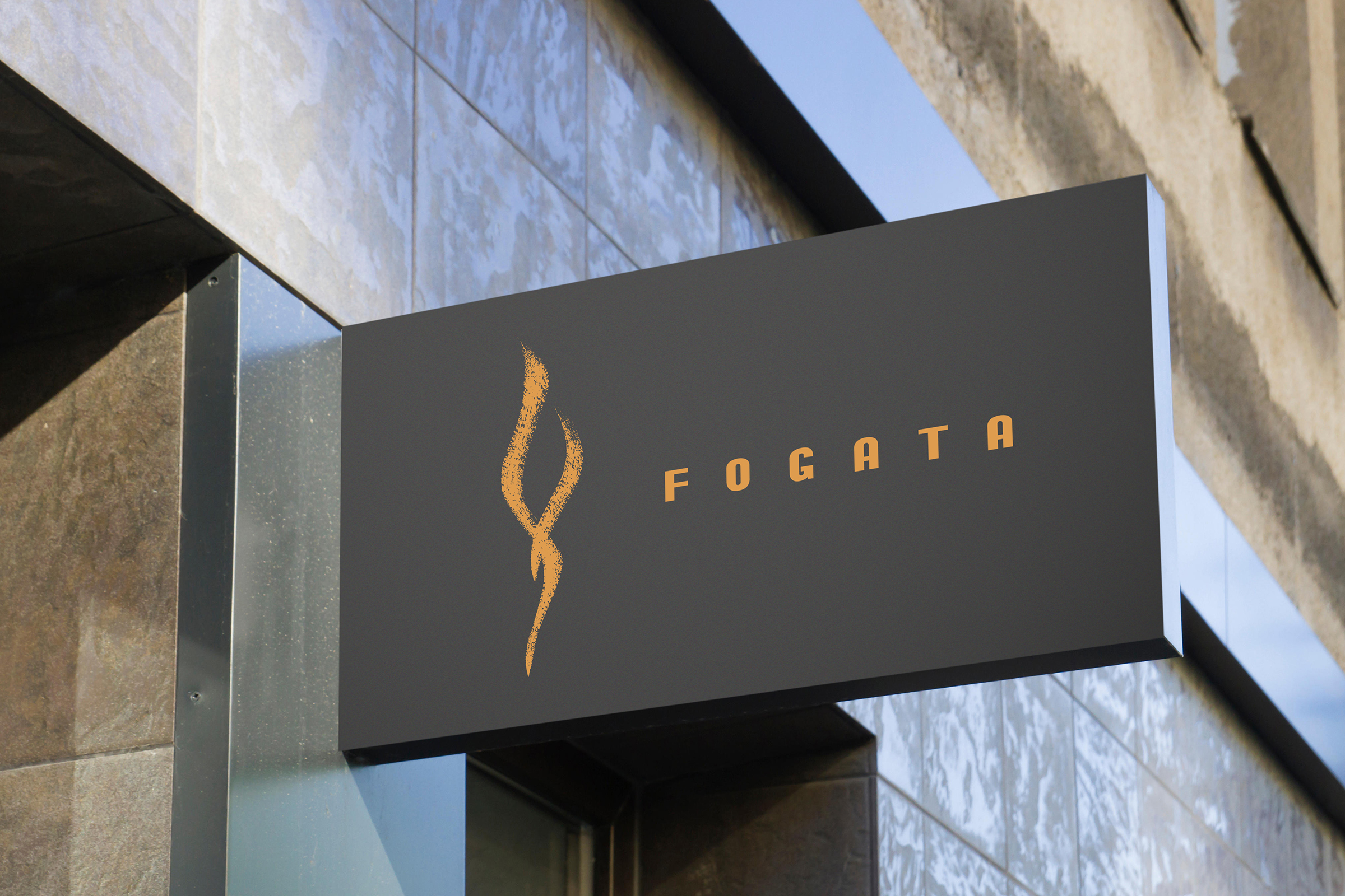
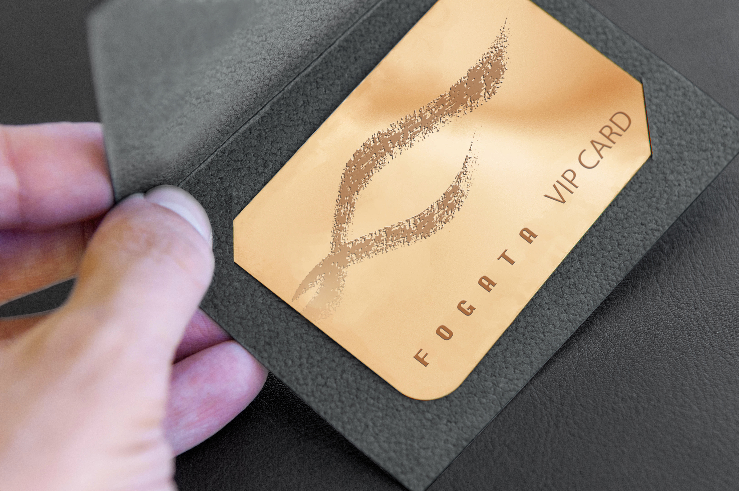
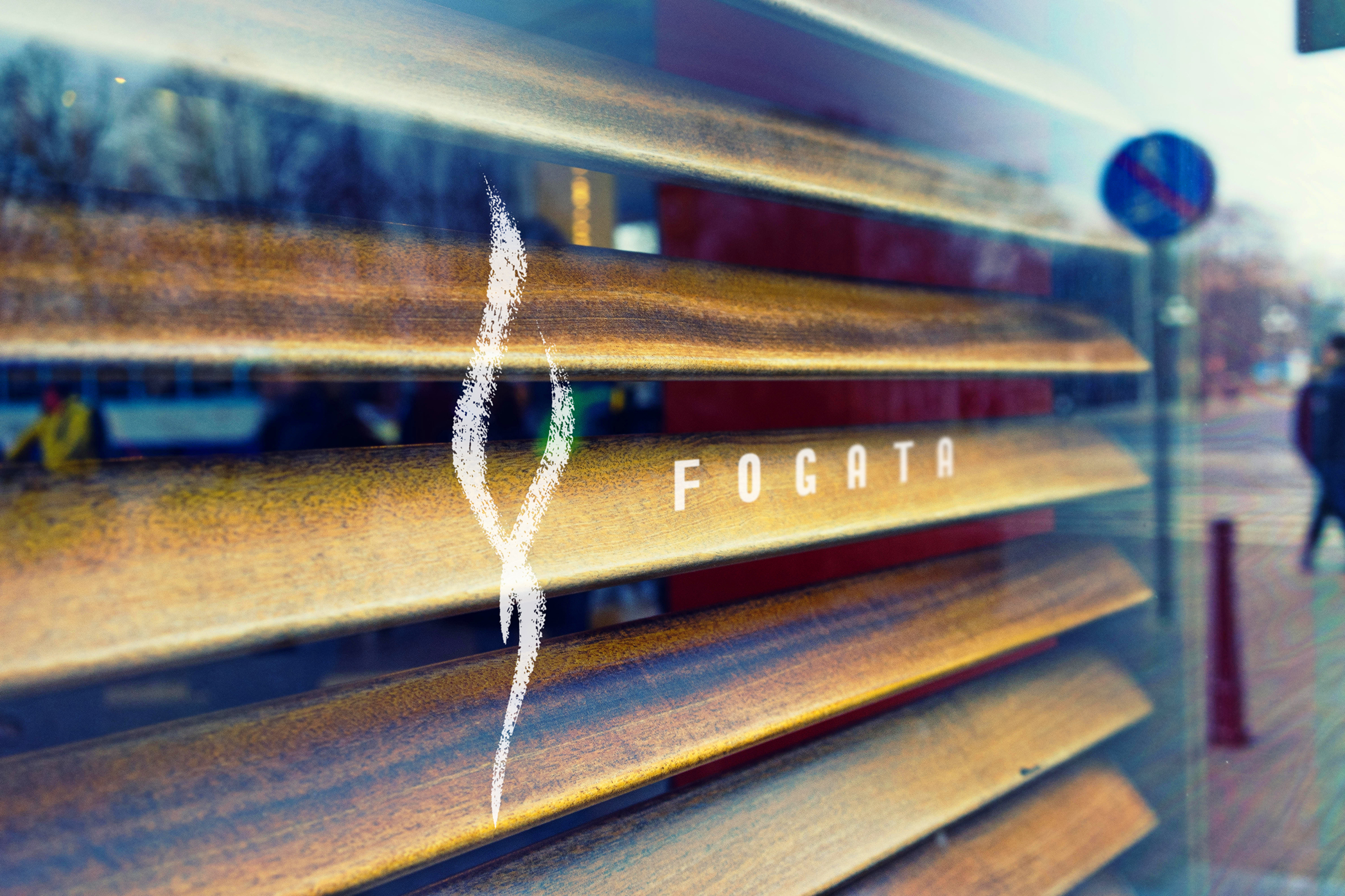
In Spring 1997, we drew our very first logo design with a calligraphy brush and ignited the spirit of Fogata restaurant in the town of Whistler. The Spanish word stands for wood fire, hence we came up with the image of fire in the form of letter F. In order to highlight the brand's unique flair and sense of warmth, a special brown color was selected on a vast field of dark gray. The combination of authentic Mediterranean food and elegant space creates a uniquely romantic dining experience.


Back to List
Click and return to list for other project demonstrations.
Contact Us
Join us and experience the wonder of brand creation and the joy of brand success.
