Project 012
Healthy Elements
A progressive healthy food distributor with superior products and customer education.

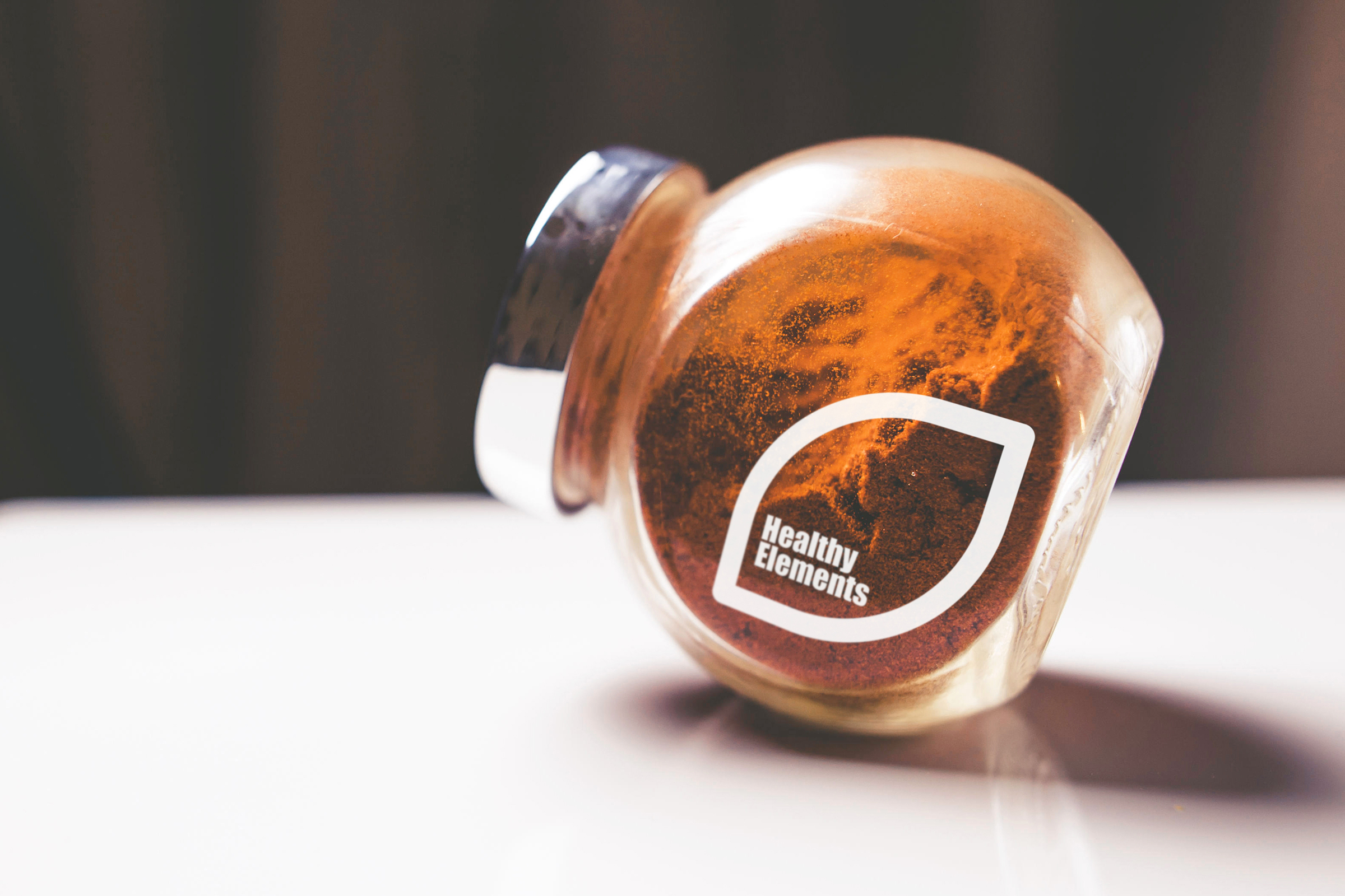
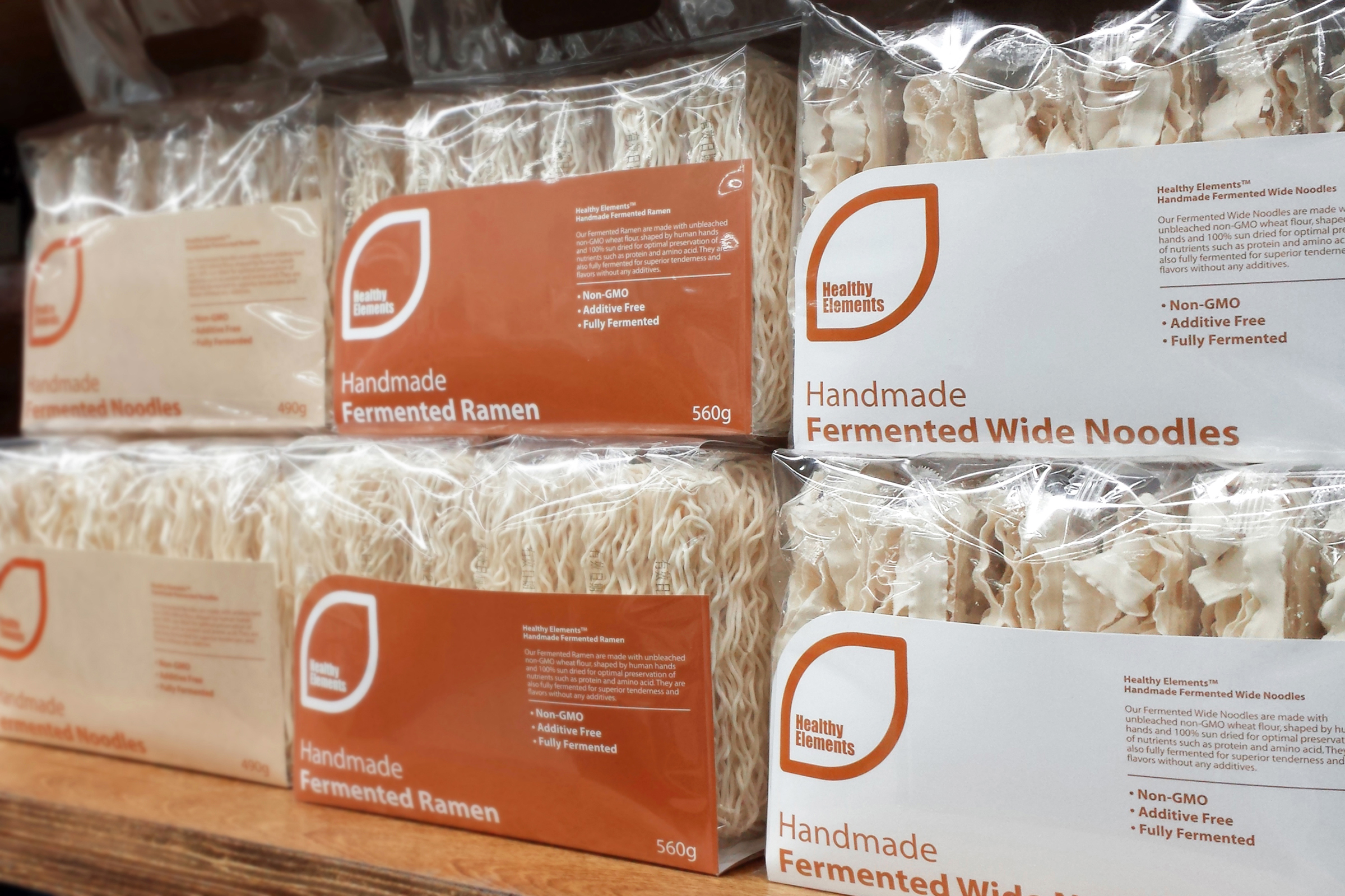
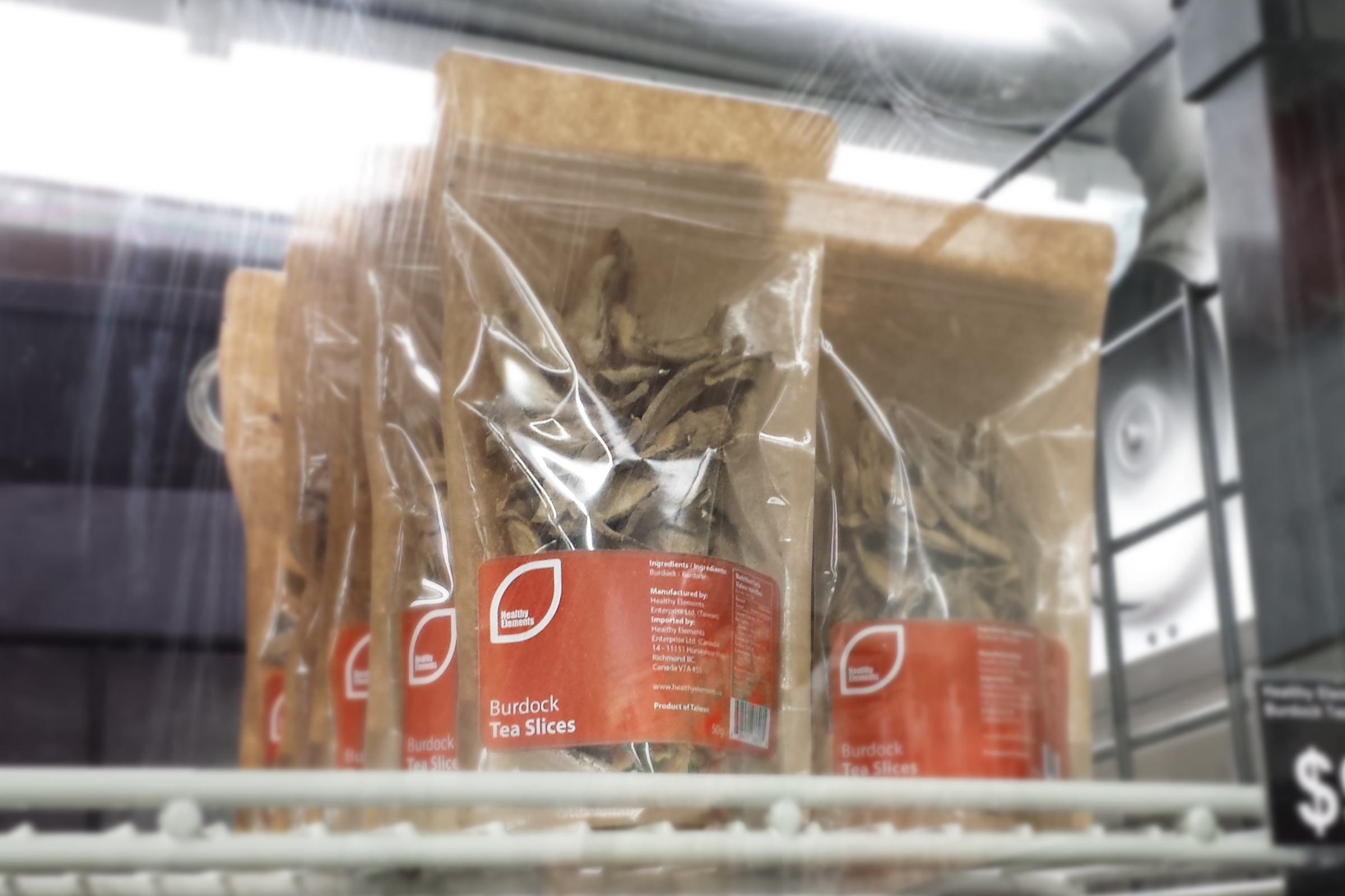
In Summer 2014, Healthy Elements was looking for a brand new visual identity to advance its image as a leader in healthy eating and non-GMO food distribution. We created a simple crop-shape icon in which the stylized brand name is upheld, giving the brand a modern agricultural presence. A soil-like brown color scheme was chosen for the brand to emphasize its commitment to natural eating. A comprehensive product visual system was also developed for a powerful collective brand image.


Back to List
Click and return to list for other project demonstrations.
Contact Us
Join us and experience the wonder of brand creation and the joy of brand success.
